Change the channel.
Any YouTube video or playlist, on an old TV: only from before 2000, on numbered channels, on a shelf of tapes sorted by year. Zaporama comes from the makers of Kasetten: the same player, the same on-screen language, its own name and logo. This book covers where the two differ and links to Kasetten’s book (in Turkish) for what they share.
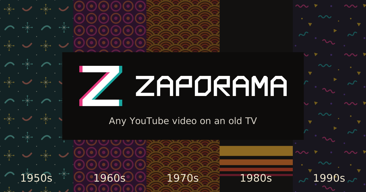
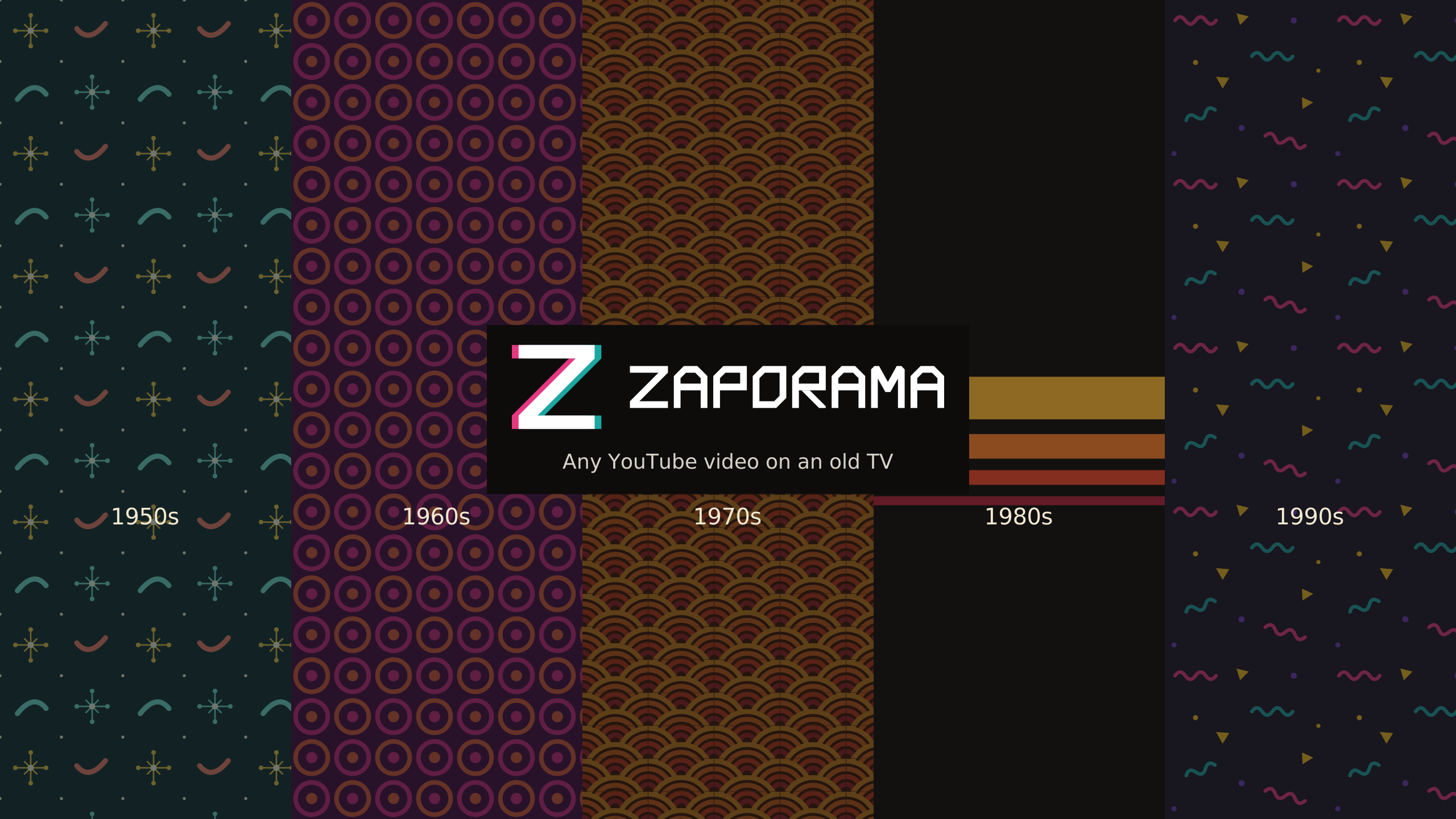
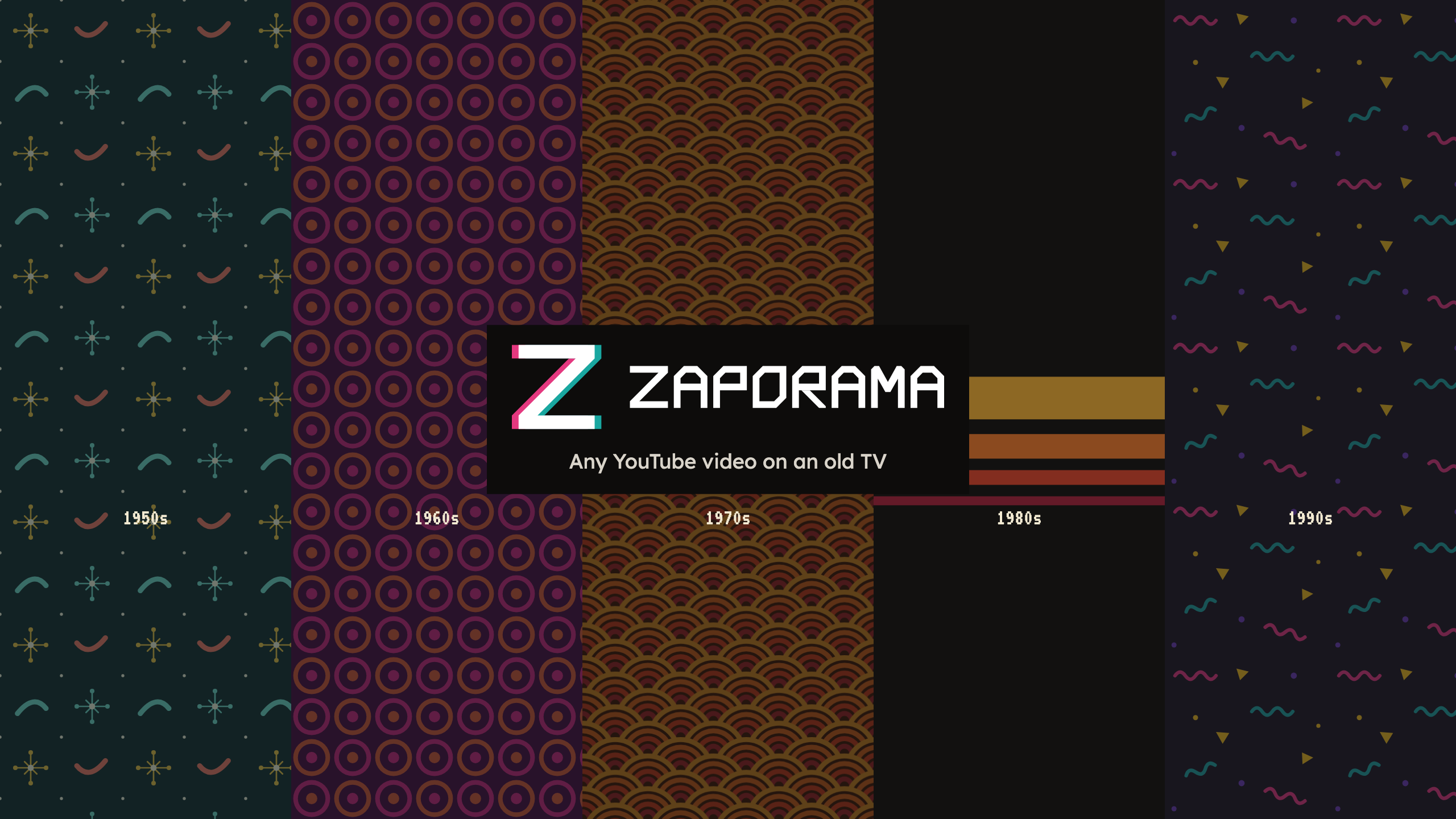
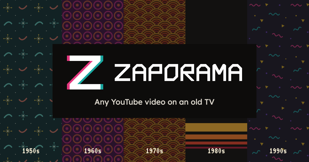 Cover: the share image. The shelf’s decades side by side, the logo on a plain night plate.
Idea
On old TVs, changing the channel made the picture slip for a moment: red to one side, blue to the other, colored fringes at the edges. On VHS copies the same colors bled past the letters.
Zaporama’s mark holds that moment. Kasetten’s chamfered Z sits in the middle; behind it a pink Z has slipped left and a teal Z right. The name comes from the same place: zap, to change the channel; -orama, to see it all at once.
Kasetten is for people’s own home tapes, in Turkish. Zaporama is open to the world, speaks English and plays other people’s videos. Everything they share (the TV, the remote, the shelf, teletext) is in Kasetten’s book.

Logo
Three layouts, two color versions, one single-color version. The default is the horizontal color logo. The logo is never typed in a font; always use the files.

Color shift
MARKLight and dark backgrounds

Single color


Clear space and minimum size
Keep at least g of clear space around the logo. g is one fifth of the Z’s height, the same measure as Kasetten’s. The color shift doesn’t count as clear space; it is part of the logo.
HORIZONTAL · 20 PXSTACKED · 64 PX WIDEMARK · 16 PX SINGLE COLOR · 12 PX
Color
The palette is Kasetten’s; Zaporama’s background is night. The two colors of the shift are Kasetten’s two accents: tape pink and Memphis teal. They are the logo’s colors, not interface colors.
Period wall colors
Background and pattern colors of the three walls added for Zaporama. The pattern sits over the background at low opacity (06); colors from 1980 on are in Kasetten’s book.
Type
Kasetten’s three typefaces, in the same roles. The logo is a drawing; these are for headlines, text and on-screen type.
1987 SPChannel number, year, time, on-screen menu, teletext. All caps.
Writing the name
Patterns
The wall behind the TV wears the year of the tape in the middle of the shelf. Kasetten’s walls started in 1980; since Zaporama plays everything before 2000, the missing decades were added: the atoms of the 1950s, the rings of the 1960s, the rainbow of the 1970s.
Decade by decade
Every Zaporama wall. Since it only plays videos from before 2000, Kasetten’s post-2000 walls (rays, flowing lines) aren’t here.On-screen language
Zaporama’s TV talks like Kasetten’s: VT323, white, hard shadow, in the corners; the middle of the picture stays clear. Sizes, pixel icons and teletext are in section 08 of Kasetten’s book. Only two things differ here: the language is English and the channels are numbered.

Pixel logo
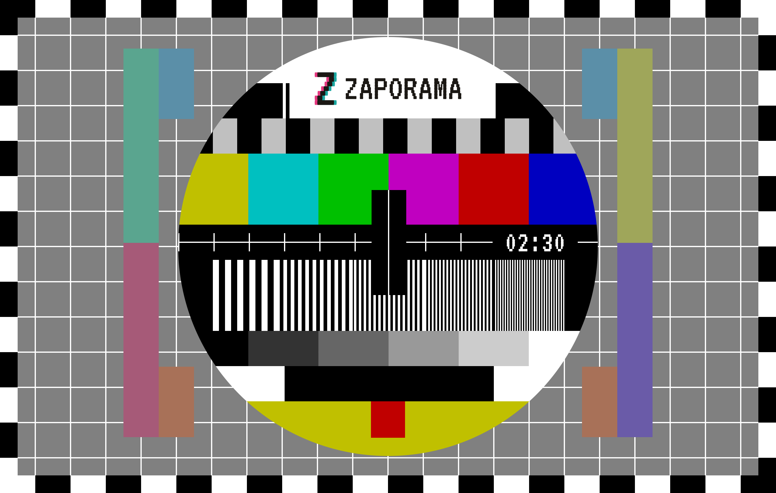
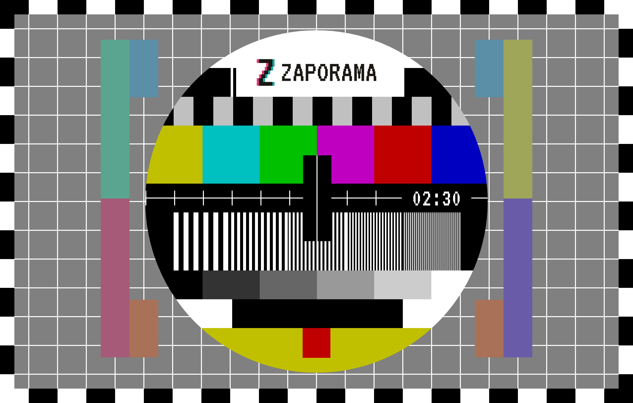
Inside the screen the logo is set in the screen’s own typeface. The Z is VT323’s Z with the same color shift; ZAPORAMA is VT323. Every row of a VT323 letter bulges slightly at its sides, like a scan line on a tube, and the mark follows the same rule, so mark and name read as one line of type. Only on screens: blue screen, test card, the watermark on the site’s TV. Everywhere else use the chamfered logo (02). Kasetten’s pixel logo is drawn the same way (K◀◀ from VT323’s K).


Web
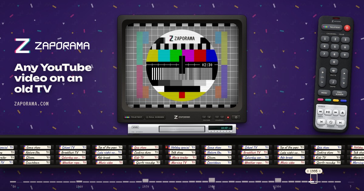
Favicon, app icon and share image. All of them are the white color-shift mark on night; it reads the same in a light or a dark tab bar.
 Zaporama · Watch any YouTube video on an old TVZaporama · Watch any YouTube video on an old TV16 PX32 PX48 PX
 ICON · 68%
 MASKABLE · 52%
Share image
YouTube and social
Profile, banner and watermark at YouTube’s sizes; the profile picture is the same on other platforms. The banner is a wide version of the share image.
 DESKTOP · 2560 × 423ALL DEVICES · 1546 × 423
 PROFILE · CIRCLEPROFILE · 800 × 80040 PX
Don’ts
ZAPORAMAFiles
Ready-to-download files. Logos as PNG and SVG on transparent backgrounds; web and YouTube files at platform sizes. No logo is made outside these files; changes go through the script that draws them.